


HORNZ
Major Project
"How is brand identity used to sell and promote music?"
This project was to show how effective a mascot is to a rock music band.
The first image is the logo I created for 'HORNZ' (a fictional rock band). The white on the black background is made to look like it has been etched into a surface, to give a more 'rugged' effect.
This shows the development of the HORNZ mascot, with the initial sketch, through to colouring and then eventually developing the design on Adobe Photoshop.
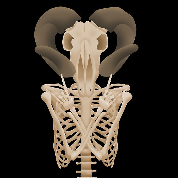
This is the final full body mascot design.
Once I had the main mascot, I then developed the different characters that could possibly represent the members in the band.
After creating the characters graphically, I then stripped them of a lot of detail to create them on lino. I thought this would expand the possibilities for any merchandise made for the band - for example, designs could now be printed or stamped onto t-shirts/ posters. I also lino cut the earlier logo shown in the first image.
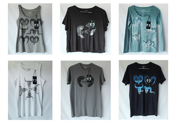
This shows my plan for the t-shirt designs when I was experimenting with the idea of lino printing them.
These show my actual t-shirts that have been printed with lino stamps and have their own unique tags.
This is a close-up of one of the tags, on the front and the back are the usual logo side and price, but in the middle it shows what the t-shirt looks like when being worn and the dates for a 'tour' - the t-shirts being used as advertising for a music event.